The secrets to successful data visualization

Effective data visualization is about more than designing an eye-catching graphic. It's about telling a clear and accurate story that draws readers in via powerful choices of shapes and colors. These are some of the observations you'll find in the insightful new book Visualize This: The Flowing Data Guide to Design, Visualization, and Statistics (Wiley) by Nathan Yau, the blogger behind the popular site Flowing Data. On his blog, Yau analyzes a wide variety of graphs and charts from around the world--and often sparks online discussions and debates among designers.
For a brief introduction to his book's key points, check out this video from Yau's publisher, below. And keep reading for my short review of Visualize This, as well as my Q & A with Yau, in which he offers some fresh tips you won't find in the book.
Is Visualize This worth reading? Yes. It's a clearly written, elegantly designed resource, presumably intended for designers and students who want to create effective data visualizations. But it's also a timely and helpful guide for anyone, from corporate executives to scientists, journalists to consumers, who want to understand how and why good data visualizations work.
Yau offers smart, concise observations written in conversational language about not only gathering and illustrating information, but also understanding the information. In other words, he argues that designers need to be analysts and storytellers and not just the creators of visuals. He poetically characterizes data visualizations as "somewhere in between journalism and art." It's a particularly engaging description, made more so by his point that the best examples are, fundamentally, entertaining narratives. They are told via graphics rather than paragraphs, but with the goal of any good story, no matter what the medium: to trigger an emotional reaction.
I asked Yau about the current state of data visualization and the secrets to successful graphs and charts. Here's our exchange:
Why is data visualization so important today--to companies, to students, to the average person eager to understand complex information?
Data is everywhere nowadays, and there's plenty more of it come. Companies store information about their customers and what users are doing online, so as the company, you want to know how people are interacting (or not) with your product or service and figure out how you can improve. As an individual, you should be aware of the data that's being recorded about you. On the flip side you can use this data to your advantage to learn more about yourself, your surroundings, and what's going on in the world. Data visualization is a great way for people to try to understand what this data is saying, and a lot of companies are hiring people who have visualization skills.
If you could name only one essential tip for designers seeking to creating a great data visualization, what would that one tip be?
It's common for designers to jump right into creating a graphic and spend just a little bit of time looking at the data. Take a little time to understand the data in front of you, and your graphics will be much more useful.
What is your favorite data visualization (at this moment) and why?
Eric Fischer's work with maps and social media has been interesting. For example, a while back he mapped Flickr photos and color-coded them by whether they were taken by locals or tourists. (See below for Fischer's London map)
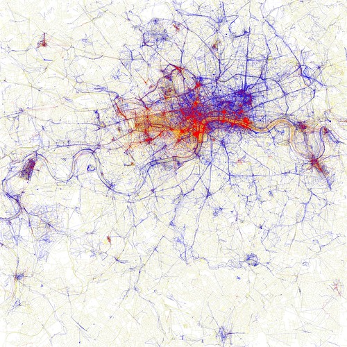
This data isn't directly available on Flickr, but it's a nice example of how a little bit of analysis and better understanding of the data can make your graphics that much better. More recently, Fischer mapped Flickr photos and tweets together, so you can see where people say something more often than they see something. Again, the idea is simple, but the maps are informative and beautiful.
Is "simple" the best approach to data-visualization design?
Some people think that if you don't understand a data graphic right away, that it's no good. Some complex datasets require complex visualizations. In general though, simpler is usually the best way to go in the sense that you should make it as easy as possible for a reader to understand what's going on. You're the storyteller, so it's your job to tell them what's interesting.
Photo: Eric Fischer/Flickr
This post was originally published on Smartplanet.com