The power of universal design at Ed Roberts Campus


Universal design is a design philosophy that says products, buildings and environments should be inherently accessible by all people with all abilities. Yep, the Americans with Disabilities Act mandates that certain buildings be built with wheelchair ramps and offer signs in Braille, but universal design often goes well beyond merely making a space accessible. As the Ed Roberts Campus in Berkeley, California, shows, universal design can also be beautiful, inviting design.
The building is named after the late Ed Roberts, who was the first student with significant disabilities to attend UC Berkeley. He was also a MacArthur fellow and a pioneer in the independent living and disability rights movements. The campus houses a number of accessibility-focused organizations, such as Lighthouse for the Blind and the Center for Accessible Technology, as well as a fitness and community center.
On a tour of the $36 million building, which was designed by San Francisco firm Leddy Maytum Stacy and opened in April, architect William Leddy pointed out the many details and considerations that went into the structure.
Important design elements begin even before one steps inside. The sidewalk in directly in front of the building is textured to signal to those approaching who have no or low vision that they're near the entrance.
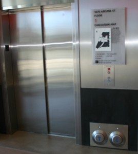
The building's doors are sensor-controlled, which one would expect, but have you ever watched someone in a wheelchair beckon a elevator? For some, it's a simple task, but for others, with no or little upper limb mobility, it can be a major obstacle. Large buttons near the floor in the Ed Roberts Campus allow someone in a chair to press the button with his foot, or even with the body of the wheelchair.
People with a very wide range of physical limitations need to access the building, Leddy said, and sometimes those limitations conflicted with each other. An architectural element that "is good for someone in a wheelchair might be hard for someone with a visual impairment," he said.
The main meeting area in the building is large, with concrete floors that have zones of differing textures and shades. This allows visitors who are blind or have very low vision to be able to locate walking zones with their canes or ascertain the walkway based on the contrasting colors. A water feature provides these visitors with an "acoustic cue" around which they can orient themselves. They'll remember these features on subsequent visits and therefore navigate the space more quickly and easily.
But for a visitor with very low hearing ability, the acoustics in this large space, with its concrete floors, can make discerning voices and words difficult. To mitigate this somewhat, the ceiling is covered in a very soft, absorbent material designed to improve the acoustics.
Making it easy for staff to access the facilities independently was another important consideration.
After hours, the building is accessible to authorized personnel through a key card system. But what if those visitors can't easily access the card that's, say, stowed in their backpack? That's addressed through extra large key card readers, with very large antennas that can read key cards from a long distance.
The winding, light-filled ramp with its bright red parapet is the building's hallmark. "It's iconic, memorable, but also practical," says Leddy. It ties the building's two floors together and, without the clinical feel of a hospital, makes very obvious that the building is first and foremost about accessibility.
Leddy notes that making the building inviting to people with all types of abilities, without segregating them, was also important. For example, the walkways on the second floor are seven feet wide. This well exceeds ADA requirements. It's designed to allow three people -- two in wheelchairs and one on foot -- to walk abreast.
"This building isn't about ADA," said Leddy. "It's about celebrating the diversity of the human condition."
(Thanks to the San Francisco Planning and Urban Research Association (SPUR) for granting Smart Planet access to the Ed Roberts Campus tour.)
Also, check out this video which describes some of the architectural elements and motivations behind the design of the Ed Roberts Campus.
This post was originally published on Smartplanet.com